Admin onboarding
My work on this project reduced activation failures and support costs with better instructions, form validation, and adding actions to the homepage and error messages.

Tools: Adobe XD, Whimsical, user research
Client: ArcGIS Hub, Esri
My Role: User Interface Designer, 2019
My work on this project reduced activation failures and support costs with better instructions, form validation, and adding actions to the homepage and error messages.
Tools: Adobe XD, Whimsical, user research
Client: ArcGIS Hub, Esri
My Role: User Interface Designer, 2019
Project overview
The problem
Admins had to follow specific instructions for a premium upgrade. If done out of order or left unfinished, 80% failed. Engineers had to help support tickets, delaying feature development.
Discovery & exploration
I first interviewed a recently activated customer to understand their pain points. I also requested a demo of the end-to-end process to see the problem for myself. Then, I brainstormed opportunities with my team.
What I helped deliver
Solution
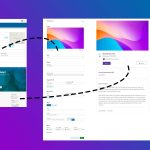
We improved our emails to give clear activation instructions to administrators. We enhanced the activation process with improved helper text and validation. Users now land on a redesigned homepage with a welcome message or get an error message with new support contact information.
Outcome
A 50% reduction in overall support tickets related to activation and a decrease in severe support tickets that involved pulling in multiple developers.
My contributions over two iterations
- Dissected the activation customer journey by interviewing a newly onboarded user of the product. Took time to understand the main pain points of new and previous customers.
- Wide design exploration comparing 4 medium-fidelity patterns with stakeholders and developers to narrow down the direction we would then investigate with customers.
- Facilitated and analyzed user feedback. A first-click test (I ran with participants at a conference booth) helped us learn both the global “New” button with dropdown and the individual actions from cards on the page were equally used so we kept both in the interface. Preference testing (I led via Zoom calls with customers) helped us structure the new elements by priority and combine metrics with actions since users often missed the dashboard page.
- Designed SVG illustrations in Adobe Illustrator based on the simple item icons to be placed in the new card headers.
Process case study
Email me for the password to read more details about:
- problems
- opportunities
- redesign we shipped
- two rounds of feedback
- updates shipped
- my reflections